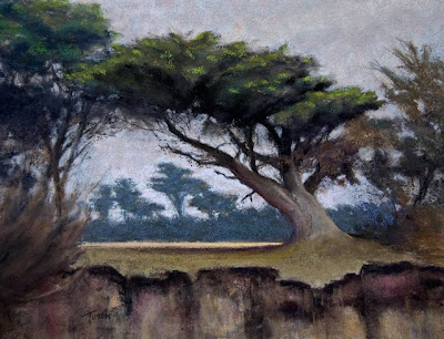
Thursday, August 6, 2009

Poplar Beach, Half Moon Bay

Here's another of my favorite locations of late for plein air painting.


Cliff-Defying
Pastel
12x16


Poplar Beach in Half Moon Bay offers dramatic views. Take the pathway South from the parking lot, and you come to this cyprus grove overhanging a cliff.


View Larger Map

Thursday, February 5, 2009

Pastel Underpainting

A number of times I’ve been asked about my pastel underpainting process. I’ve developed a unique technique of using a monotone (or sometimes duotone) underpainting to start my pastels. Here’s an example of a painting done on location in Half Moon Bay California. This was a beautiful day in December looking East around 10am.

I started with a few quick sketches each around 2” x 3” to try different compositions. From this I quickly moved to blocking in a composition using a water-based media on Wallis sanded paper mounted on museum board.

My goal when underpainting is to block in the major shapes and relative values to develop the composition. I do this fast and loose. Using a single color makes it very easy to add and subtract paint rapidly without concern for the color composition or for colors going muddy. I also like using a uniform color because later I’ll let some hits of underpainting color peak through the pastel and the consistent color adds cohesion to the painting. I also often use very vivid colors to add liveliness to the finished painting.

For this painting I primarily used magenta gouache (Bengal Rose by Winsor Newton). Near the end of the process I also used a darker blue to push some of the darker values since the magenta isn’t very dark even when used thick and full strength.

When I’m using a toned support (this was Wallis Belgian Mist) I sometimes find that bits of the paper color peaking through a very light value sky can be distracting. For this reason I blocked in some very light values where I anticipated I’d be adding clouds.

Here you can see the start of the underpainting in relation to the site.


And here's the finished underpainting.


For this underpainting I used 2 colors plus white (duotone). I’ll often only use just a single color (most recently I've been drawn to magentas), and I find this works really nicely as well.


And then the final piece …

Friday, January 23, 2009

Cleaning Up Photos of Paintings in Photoshop

Artists often struggle to get good professional looking photos of their work. It used to be very important when shooting slides to have pristine lighting conditions and to shoot bracketing shots at various exposures. But in this digital age I have found that with Adobe Photoshop the quality of the photo is much less important (within limits).

In my critic group I was explaining the steps I take to cleanup photos of my paintings. There was a fair amount of interest, so I thought I’d write it up for those that are curious. Following this process I can now reliably touch up a photo in just a few minutes.

First - it's a good idea to have your computer monitor calibrated. I use a product called 'color munki' from x-rite. Otherwise you might adjust a photo to look good on your monitor, but it will look wrong/incorrect elsewhere. The first time you calibrate your monitor you will probably find that the monitor needed to be tweaked quite a bit (which incidentally also points out that anyone viewing your work without a calibrated monitor is likely to see variability in the colors, so don’t get too worried about perfection if you are only cleaning up photos for use on the web).

I photograph artwork in my studio. I'm fortunate that I have good natural light, and I often rely on this. But I also have good artificial light with a mix of full-spectrum bulbs - and I find I can take photos at night with acceptable results. The photo must be in focus and evenly lit with no hot spots. But color temperature and dim lighting can be adjusted. The photo should also be nice and square in the viewfinder (it should look like a rectangle with 90 degree corners – not like a trapezoid).

Once I have the photo, these are the steps I take with Photoshop to clean it up:

    • Crop - cut the photo down to just the artwork. Be sure to square up the horizon line at this point if it doesn't appear level. In photoshop you can correct the horizon by dragging the mouse outside the crop box to slightly rotate the image to get the horizon level if necessary. Another great trick is to shrink the crop box so that the bottom edge overlaps the horizon, then rotate so the bottom of the crop box aligns with the horizon, and then re-stretch the crop box. This takes a lot of the guesswork out of the alignment process.
    • Levels - Under Image->Adjustments->Levels you will find a tool that shows a spectrograph of how much information you have across the full value range. You’ll almost always find that you have no information within the darkest darks or lightest lights. With this tool, you can slide the sliders to ‘cut out’ these unused area, and photoshop will re-stretch your existing values across the full value range. This makes a huge difference.
    • Color Balance (Image->Adjustments->Color Balance) - this lets you separately adjust the highlights, midtones and shadows. I find that if I adjust the highlights very slightly towards yellow and the shadows very slightly towards blue this usually brings the photo closer to the original artwork.
    • Exposure (Image->Adjustments->Exposure) - sometimes I take the exposure down just a touch if after these previous steps the photo seems too bright or over saturated.

If you’re unfamiliar with the tools I’ve mentioned, use Photoshop help to get some additional instructions on using any of these tools. Good luck.